
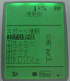
Keitai-Font
Keitai-Font (2001) was a TrueType font that displayed NTT DoCoMo i-mode emoji on Windows and Mac so web designers could build i-mode sites.

Tokyo-Font & Keitai-Font
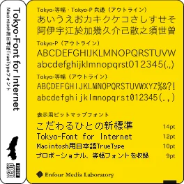
Tokyo-Font for Internet (2002) paired TypeBank Gothic SL kanji with Typos 56 kana and hand-tuned bitmaps for crisp Mac email and web text.


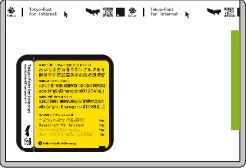
Jacket design: Takafumi Miyajima
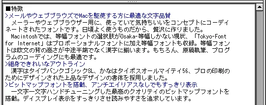
These fonts were made with one basic concept: to give people who use a Mac as an everyday tool a convenient, easy-to-read, and beautiful “browsing font”. They are designed to balance on-screen readability with printed results.
Bitmap fonts are built in at four sizes (9*, 10, 12, and 14 pt), so small text is easy to read even without anti-aliasing. Every character has of course been hand-tuned, without spoiling the look of the outlines.
Printed output is a slim, refined Gothic — perfect for anyone dissatisfied with the OS’s standard fonts, and ideal for writing manuscripts and business documents.
* Tokyo-Mono includes bitmap fonts at 10, 12, and 14 pt.
Example: email
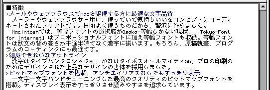
Osaka-Mono (12 pt display)
Tokyo-Mono is designed for horizontal setting, so its centre of gravity is stable and well seated; text does not look scattered and is easy to read. (12 pt display)
Example: email footer
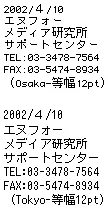
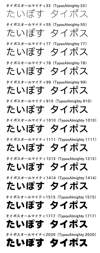
In Osaka-Mono, half-width and full-width alphanumerics differ in height… In Tokyo-Mono, half-width and full-width alphanumerics are the same height, so nothing looks out of place. The Typos Allmighty kana are clean and easy to read, with a near-future feel that makes using a Macintosh a joy. The slightly larger kana improve readability further.
Example: spreadsheet
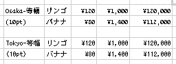
Osaka-Mono has no 10 pt bitmap, and its numerals are small. Tokyo-Mono has a 10 pt bitmap, and its numerals are well balanced.
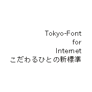
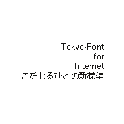
14 pt display · 12 pt display
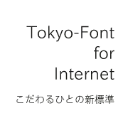
Anti-aliased display
9 pt display · 10 pt display
CD-ROM, installation manual
Q: Will there be a PostScript version? A: There are no plans for a PostScript version (as of May 2002). For PostScript-dependent environments, please get our PostScript font packages and use a recomposite font made with Adobe Type Composer, or your application’s composite-font feature: – Typos A55 in [Typos Allmighty]
Please talk to us about the half-width fixed-pitch characters for Gothic SL.
March 8, 2002
Enfour, Inc. today announced the release of Tokyo-Font for Internet, TrueType fonts for Macintosh optimised for email and web browsing. It also announced that Enfour, Inc. and Enfour Media Laboratory, Ltd. will be integrated into a single company, Enfour, Inc.
Text quality ideal for anyone who uses a Mac for email and web browsing Fonts coordinated for mail and web browsers around the concept of being a pleasure to use. Because these are fonts you use every day, we made them without compromise.
On the Macintosh, the only monospaced font choice today is Osaka-Mono. Tokyo-Font for Internet includes a monospaced font as well as a proportional font. In the monospaced font, the height of Latin characters is not awkwardly in-between but aligned with the kanji. It is, of course, also ideal for writing manuscripts and coding programs.
Slim, beautiful outlines
Built-in bitmap fonts for crisp display even without anti-aliasing Top-quality bitmap fonts, hand-tuned character by character, keep the screen display crisp and readable.
Early April 2002
CD-ROM, installation manual
Tokyo-Mono
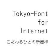
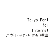
Anti-aliased display · 14 pt display
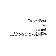
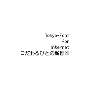
12 pt display · 10 pt display
Tokyo-P
14 pt display · 12 pt display
Anti-aliased display
9 pt display · 10 pt display
More display samples
Enfour Media Laboratory, Ltd., a font-file technology company, and Enfour, Inc., a double-byte handling technology company, had been jointly developing the “Global Series” of multilingual solutions: GlobalType, technology for embedding fonts in devices; GlobalEase, which provides input environments for more than 55 languages; and GlobalView, which displays text in 65 languages simultaneously on the internet. To strengthen the series, the two companies removed the boundary between them and merged to create synergy.
Tokyo-Font for Internet follows the Windows extended character set rather than Apple’s. Combined with mail applications and web browsers whose code tables are built straightforwardly, it lets a Macintosh display the platform-specific characters Windows users type without thinking. (This is not a supported use.)
Incidentally, the Enfour group is celebrating its 10th anniversary. Gaiji Kit, released in 1992 and the starting point of Enfour, solved the garbled-character problems that occurred between Macintosh computers and PostScript printers.
Includes Unicode tables for Mac OS X.

Keitai-Font (2001) was a TrueType font that displayed NTT DoCoMo i-mode emoji on Windows and Mac so web designers could build i-mode sites.