ENFOUR TYPE COLLECTION TypeBank 01
ENFOUR TYPE COLLECTION TypeBank 01 (Feb 1999) packaged 16 TypeBank Mincho, Gothic, and Maru Gothic typefaces as PDF-embeddable CID fonts.


TypeBank / ENFOUR TYPE COLLECTION
TypeBank's five-part essay on Japanese type design: what a typeface is, design elements, digital fonts, the family concept, and TypeBank faces.
The Typeface Laboratory is a five-part essay by TypeBank Co., Ltd., the designer of the ENFOUR TYPE COLLECTION typefaces, published on Enfour’s font site. It explains what makes a Japanese typeface readable, beautiful, and of high quality: the meaning of a typeface, its design elements and unity across 7,000 to 8,000 characters, bitmap and outline digital fonts, TypeBank’s family concept, and the design of TypeBank’s own faces.
| Author | TypeBank Co., Ltd. |
|---|---|
| Parts | 1 Meaning of a typeface · 2 Design elements · 3 Digital fonts · 4 Family concept · 5 TypeBank typefaces |
| Topic | Japanese type design |
The TypeBank Professional Font Series and ENFOUR TYPE COLLECTION TypeBank 01–04: Japanese CID fonts that pioneered PDF embedding.
Editorial note: the following romanisations are best readings from the Japanese originals and are awaiting confirmation: Takaraine, Folk, Yu Tsukiji, Gorilla, Polyester, and Latex are romanised from katakana.
Historical product information from Enfour’s original Japanese font site, translated into English. Prices, addresses, and ordering details from the period are omitted.
Japanese typefaces include the basic styles — Mincho, Gothic, and Maru (rounded) Gothic — as well as Kaisho (regular script) including textbook styles, Gyosho (semi-cursive), and Reisho (clerical script); Edo lettering such as Kanteiryu, Higemoji, and Sumo lettering; Sōchō, Koin (old seal), and newspaper typefaces.
There are also typefaces with modern design elements, such as Typos, Takaraine, and Folk. Kana typefaces designed to be combined with existing Mincho and Gothic kanji, such as Komachi, Ryokan, Himawari, and Yu Tsukiji, have also appeared. Some typefaces are used on their own rather than in combination, such as Gorilla, Polyester, and Latex, and some vendors sell Latin typefaces, kana typefaces, or sets of Latin and kana together.
More than 800 digital typefaces alone are said to be on the market today. Here, from the standpoint of a type designer, we explain what makes a typeface readable, beautiful, and of high quality.
New parts will be added in turn.
A typeface is a set of letter and symbol designs created according to a unified concept. A good typeface is, first, one whose concept is solid, and second, one that is highly finished.
When designing a typeface, its face size (jizura) and weight follow from whether it is meant for body text or for headlines. Whether it is for vertical setting, horizontal setting, or both determines the shape of the kana and their counters (futokoro). The intended image — strong or gentle, traditional or modern, hard or soft — changes the elements and the balance.
The medium the typeface will be used in also matters. Specifically, the way optical adjustment is done changes depending on whether the typeface is for letterpress, for phototypesetting, or for computer screens or printers.
Typeface design follows from that concept. In concrete terms, it determines how the module — face size and baseline (Fig. 1-1) — weight (Fig. 1-2), elements, and counters (Fig. 1-3), and balance and centre of gravity (Fig. 1-4) are designed, how optical adjustment (Fig. 1-5) is handled, and how character forms and glyph shapes are approached.
The degree of finish of a typeface, in the end, is whether all 7,000–8,000 characters of the typeface have been properly completed in faithful accordance with that design.
Just as Latin type design has reference lines — baseline, cap line, and descender — the face (jizura) is the module needed for designing Japanese characters.
The square around it is the virtual body. The virtual body is the advance width in solid setting (beta-gumi) — the width at which characters line up when simply typed in. The larger the face is designed, the tighter the characters look in solid setting; the smaller it is, the more space appears between characters. It is an important reference for choosing a readable character size that looks neither scattered nor cramped.
The parts that make up a character are called elements, and the space enclosed by those elements is called the counter (futokoro). Each element has its own name, and how each element is designed and how the counters are kept consistent are the keys to the image of the typeface.
Human vision does not pass on exactly what it sees to the brain; it alters the image slightly depending on the surroundings. For example, in the figure, two diagonal lines crossing a thick vertical line appear to the eye to be offset where they cross. Type designers must design the thickness and position of each element with these optical illusions in mind.
A Japanese typeface contains kanji, hiragana, and katakana (including small kana), numerals, and Latin letters (upper and lower case), and symbols. What matters is how to build characters with such different elements into a single character set.
CID (Character IDentifier-keyed) fonts are a new PostScript font format that replaces OCF (Original Composite Format). They offer faster screen display and printing and smaller files. Their file structure supports not only Latin-only languages but also Asian languages that use large numbers of characters such as kanji, and they add new features such as variant (itaiji) switching.
Fig. 2-1 shows, as kanji examples, 「国」 and 「轟」, which have different numbers of horizontal and vertical strokes. Stroke thickness must be finely adjusted according to stroke count so that every character has the same overall darkness (kuromi).
It also shows the new and traditional forms of 「鴎」, as in the name of the author Mori Ōgai. These can be used through CID variant switching. The right-hand component has the same shape in both, but for a well-balanced character the width of the component varies with the density of the left-hand radical, and the darkness must be adjusted for that difference in width. In fact, comparing the 「鳥」 component in the two characters, the one in the new form is wider than the one in the traditional form, and the darkness has been adjusted so the two look equally dark. Without such fine adjustment you cannot get a single, well-balanced character.
Here, as kana examples, are characters with different kinds of shapes.
Some, like hiragana 「の」, are close to a perfect circle; some, like 「つ」, are wide; and some, like 「く」, are tall. How to treat the counters of characters with such different shapes is important, and their sizes must be adjusted according to shape.
While hiragana 「あ」 is round, katakana 「ア」 is an inverted triangle, 「ム」 a triangle, 「ネ」 a diamond and 「ロ」 a square. If all of these were designed to fill the frame, the square shapes would look much larger than the others. Conversely, unless diamond and triangular shapes are sized while checking the balance with other characters, they tend to look small.
Some hiragana and katakana also carry dakuten and handakuten (voicing marks), and their position and size must be considered. Small kana come in versions for vertical and horizontal setting, and their size and position must be chosen with an eye to how they will actually be used in setting.
A CID Japanese typeface set contains two kinds of Latin letters, numerals, and symbols. In most typefaces used on the Macintosh today, what is typed in alphanumeric mode is called proportional Latin, and what is typed in kana mode is called 2-byte Latin. As the name suggests, proportional Latin characters have widths matched to their shapes, so they are used for long English text and for mixed Japanese–Latin horizontal setting. 2-byte Latin characters, on the other hand, have full-width spacing like kanji and kana, which is handy when you want to use them as symbols or centre them in vertical setting.
For symbols such as question marks and parentheses, too, the 2-byte versions are used when setting Japanese, and the proportional versions when setting Latin text. Their design must therefore take size and position into account according to use.
Characters are arranged vertically in order of increasing horizontal strokes, and horizontally in order of increasing vertical strokes.
There are two kinds of digital fonts: bitmap fonts and outline fonts (Fig. 3-1). Bitmap fonts represent characters as collections of dots, while outline fonts describe the outer shape of characters with mathematical curves. However, outline fonts have to be converted from outline information into bitmap information (rasterised) when they are displayed on screen or printed. Enlarging a bitmap font produces conspicuously jagged characters, whereas outline fonts keep their shape well when scaled up or down. In the world of digital fonts, it is common to use fast bitmap fonts for screen display and outline fonts, which keep their quality when scaled, for printing.
Fig. 3-3 shows these digitally adapted elements in concrete terms. Compare it with the rasterisation in Fig. 3-2 to see the effect.
Digitally adapted design has data advantages too, such as small file sizes. It also makes outlines easy to work with when end users, for example, transform characters into 3D on screen or convert them to outlines to make a logo. It also prevents filling-in and fading, works at every output resolution, and makes hinting easier.
This high-quality design, suited to output across a wide range from low to high resolution, has already been adopted by many systems and is highly regarded by users.
Partly because of the 1995 Unicode standard (JIS X 0221)*, and with Supplementary Kanji (JIS X 0212) and Levels 3 and 4 (JIS X 0213) also emerging as Japanese character repertoires, demand for gaiji seems to be growing.
In practice, publishers and library organisations, which use a great many characters, and hospitals and schools, which need rosters and address books, find the JIS X 0208 repertoire insufficient, and end users often go to the trouble of making characters with gaiji creation tools.
* A 2-byte code system defined to support the world’s languages. It became an ISO standard in 1993, and JIS X 0221 was issued in 1995 as the Japanese standard. It has been adopted as the character code system of Windows NT and others.
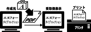
Enfour published TypeBank’s Japanese typefaces from 1995: the first CID font package and, in 1999, the first embeddable third-party CID fonts.

TypeBank 02 (May 1999) added seven new typefaces, including Midashi Mincho, Classic Mincho, TV Mincho, and Gothic SL, as embeddable CID fonts.
Enfour’s kana fonts: the Shintaro Ajioka Kana Series (Komachi, Ryokan, Tsukiji, Yukinari, Kodoken) and Typos Allmighty’s 24 Typos kana.
ENFOUR TYPE COLLECTION TypeBank 01 (Feb 1999) packaged 16 TypeBank Mincho, Gothic, and Maru Gothic typefaces as PDF-embeddable CID fonts.

TypeBank 02 (May 1999) added seven new typefaces, including Midashi Mincho, Classic Mincho, TV Mincho, and Gothic SL, as embeddable CID fonts.
TypeBank 03 and 04 offered TypeBank 01 and 02 typefaces individually, so designers could license just the faces they needed.
The TypeBank Professional Font Series (1995–1996) was the world's first CID font package: TypeBank and Ajioka kana fonts in Naked CID and OCF.