

FONT1000
FONT1000: Designers’ Own Japanese Typefaces
FONT1000 was a project of 25 Japanese type designers who made and sold their own fonts with Enfour's Kanji Edit Kit, released July 2001.
At a glance
FONT1000 was a Japanese font project in which type designers themselves handled everything from making their fonts to selling them. Its fonts were created with Enfour’s Kanji Edit Kit, and on 6 July 2001 the project released 25 typefaces prefixed ‘F1′. Enfour added all 25 to its ‘Generated by Kanji Edit Kit’ showcase, and the member profiles below are preserved from that page.
Key facts
| Released | 25 typefaces, 6 July 2001 |
|---|---|
| Naming | Typefaces prefixed ‘F1′ (e.g. F1 Circle, F1 Block Line) |
| Tool | Enfour Kanji Edit Kit |
| Members | 25 independent designers |
Part of
Every Enfour product line in one place: gaiji fonts, edit kits, TypeBank, kana, Comic-Font, screen fonts, FONT1000, and the support archive.
Editorial note: the following romanisations are best readings from the Japanese originals and are awaiting confirmation: Member name romanisations are best readings from kanji, including 七種泰史 (Yasushi Saikusa), 成澤正信 (Masanobu Narusawa), 長谷川眞策 (Shinsaku Hasegawa), and 和田庸伸 (Tsunenobu Wada).
Historical product information from Enfour’s original Japanese font site, translated into English. Prices, addresses, and ordering details from the period are omitted.
Details
Background
FONT 1000 members
Junya Aoki Design intent: I extracted the quirks of an individual’s handwriting and made them into a typeface, keeping the feel of handwriting to create a stylish (iki) face. Message: Just as people have personalities, so do letters — I want them to be stylish letters. Graduated from Tama Art University. – F1 Jaroku B
Shintaro Ajioka Born 1949 in Toyohashi, Aichi. Works widely across contemporary art and graphic, typeface, and architectural design. Created the kana typefaces Komachi and Ryokan in 1984. – F1 Kai M
Itsuo Arisawa – F1 Dodo Kaisho.TT
Takafumi Ikegami Hang in there a little longer. You love letters, don’t you? I told myself. Otherwise I felt I would lose myself. It doesn’t matter if it takes time. Hang in there a little longer. – F1 Seiryu L
Hiroshi Iseya Born 1955 in Akita. After Kuwayama Typeface Design Office, founded Hiroshi Iseya Design Office in 1981. Works mainly on letter-centred design — logotypes, symbol marks, and corporate typefaces — and directs VI/CI projects. Member of the Japan Typography Association. – F1 Line Board B
Koji Ogawa Design intent: made as seal-style (hanko) lettering. Message: next time, brush lettering. Profile: born 1964 in Tokyo; graduate of Kuwasawa Design School. Selected for the ’98 World Cup, Gabrovo, IPT, Trnava, and Lahti poster exhibitions. Eight solo shows. Member of JAGDA, JTA, TTCJ, and POTA. – F1 Kokai Myself
Akio Okumura My first love letter, written with a pounding heart. My first font, made thinking of long ago. – F1 Tegami
Tatsuji Kato A handwritten feel, an image that conveys feeling easily. Named F1 Circle because it uses many arcs. Besides FONT1000, adopted as a full-set font by Nis. Created and released Namiki Pop, Namiki Kyokasho, and Namiki Mincho. Member of JTA. – F1 Circle
Toshio Kamiya – F1 Yogurt
Tomomi Kanda My first attempt, modelled on the calligraphy of Jin Nong, whom I love. Designing without worrying about the square produced cute, uneven letters, some tall and some wide. Adds numerals and about 500 kanji. – F1 Tsubaki
Takayuki Kuwabara I joined F1000 quite by chance — I never dreamed of creating my own font. The result? Not far off, not close. But it certainly showed me how I feel about my own letters: quite stoic and steady. ‘Kesera’ was a misnaming. – F1 Kesera
Yasushi Saikusa Free chatter, conversation. Sun, greenery, breeze. Not running, not hurrying — slow and relaxed. I imagined the lightness of heading out on a picnic, feeling the natural air. Winner of the Ishii Prize and Morisawa Prize at the Typeface Contest. – F1 Walk
Eita Shinohara I have long loved Art Deco and have designed Japanese logotypes with a Deco feel. This typeface grew out of that — how will it be used from here? – F1 Ei
Masahiro Suzuki Semi-cursive strokes with partial stencil treatment; a linear design with kana unified as either tall or wide. Born 1954 in Shizuoka. Selected in the typography section of the 1980 NAAC exhibition; prize-winner at the 1996 International Typeface Contest. – F1 Waraku M
Yukichi Takada – F1 Hieros R
Shinji Tanase President of Grandcanyon Entertainment Inc. Born 1961 in Gifu; graduate of Tokyo Zokei University; studied at California State University. JTA member. With the permission of rights holder Sankeisha, digitised the Kanteiryu of Togetsu Ishibashi, author of the seal-engraving reference Rokutai Insho Jirin. – F1 Togetsu Kanteiryu
Jun Tsuchiya F1 Clip M was literally inspired by the paper clip. It aims to give a clean, effective look, especially in horizontal setting with open letter-spacing. – F1 Clip M
Masanobu Narusawa – F1 Tombo B
Kazunari Nishida Vertical strokes are vertical and horizontal strokes rise to the right. Characters with upper and lower parts are shifted left and right, and those with left and right parts are shifted up and down, for a sense of breadth and ease. Stroke ratios follow set rules, and slight wavering in the lines gives the face warmth. – F1 Cousin A-un F
Shinsaku Hasegawa ‘Once upon a time…’ — the warm words of a mother telling a story, in a felt-pen handwritten style. Kanji spacing is slightly open for a generous feel, and the edges are not uniformly rounded. Fun punctuation and alphanumerics included as a bonus. – F1 Hase Momo R
Takafumi Miyajima Born 1971 in Nagano. Graduated from the Living Design department of Kiryu Junior College. Graphic designer. After Propeller Art Works, now works mainly in typography. His digital font collection Fontgraphers BOLD 1.01 (Shoeisha) is on sale. – F1 13049PIC-JPN10
Iwao Yamaguchi Born 1951. Combining ellipses gives a linear image a gentle quality. Includes the education kanji (1,006 characters). – F1 Stick M
Masahiko Yamada I gave shape to whatever I felt like trying, and this is what came out. Normally I design logotypes, VI, and graphics in general; in Nagoya since 1952. Member of the Japan Typography Association. – F1 Yamabiko B
Takeshi Yamamoto and Tsunenobu Wada Graduated in 2001 from the evening design course of Tama Art University. Started making fonts together while students and joined FONT1000. – F1 Block Line
Yoshihiro Yoshida I aimed for a face usable for body text — orthodox, yet a little eye-catching: something like Mincho and Gothic added together and divided by two. Member of JTA, JAGDA, and I.TYP.Y. Winner of the ADC Award, ACC Grand Prix, and the Japan Typography Annual Best Work Award. – F1 Hiro
Related typography
Explore related products
Gaiji & Kanji Edit Kits
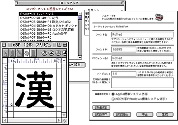
Kanji Edit Kit 2.5 turned Fontographer fonts or Illustrator outlines into 2-byte Japanese TrueType fonts for Mac OS and Windows.
Gaiji & Kanji Edit Kits
A showcase of Japanese typefaces built with Enfour’s Kanji Edit Kit, from ZEN Old Mincho to seal-script and brush fonts by independent makers.
Kana Series (Ajioka, Typos)
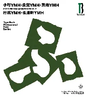
Enfour’s kana fonts: the Shintaro Ajioka Kana Series (Komachi, Ryokan, Tsukiji, Yukinari, Kodoken) and Typos Allmighty’s 24 Typos kana.